
The Toggle That Refused to Be Simple
There are parts of building a website that you expect to be complicated. Maps. Live data. Weather alerts. Radio streams. And then there is a toggle switch.
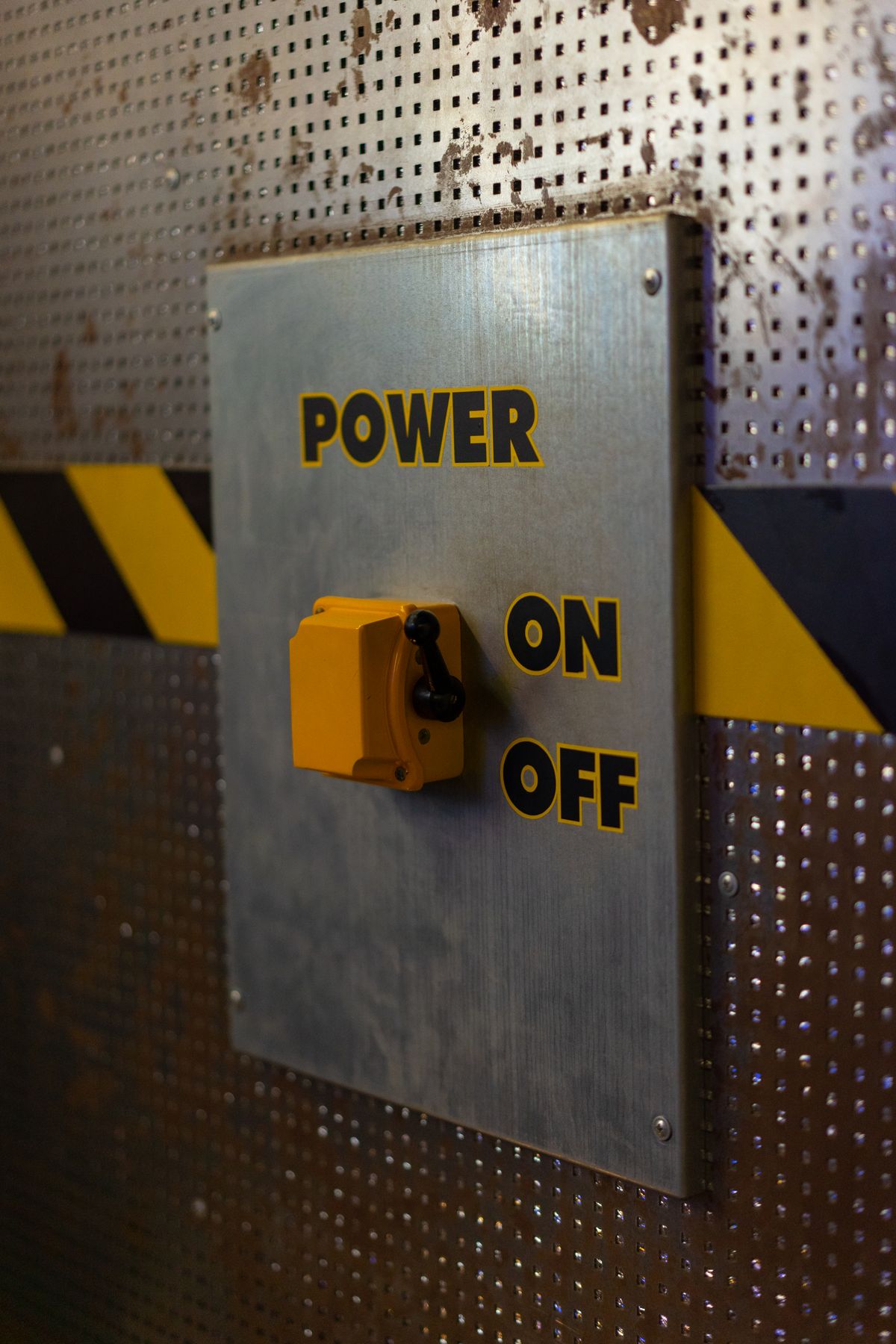
Two choices. One little control. Radius or Entire state. How hard could that possibly be?
As it turns out, harder than you would think.
It started as two buttons
IdahoLens needs a simple way to answer one important question: how much of Idaho do you want to see? Radius keeps the experience focused around a selected place. Entire state pulls the view all the way out across Idaho.
Functionally, that choice already worked. Visually, the original control felt more like a pair of buttons than a clear two-position switch. It technically did the job, but it made the visitor do a little too much interpretation.
Were these filters? Tabs? Two separate actions? Which one was selected? The control needed to explain itself without needing an explanation.
So the design moved toward something almost everyone recognizes immediately: a toggle.
Then the toggle became a project
The idea sounded straightforward. Put Radius over the left side. Put Entire state over the right side. Make the selected half obvious and use the IdahoLens orange circle to show the active choice.
Done. Except not quite.
The first versions felt too much like buttons. Then the switch was too wide. Then the orange circle did not sit directly under Radius. Then the divider did not visually land between the two labels. Then mobile had to fit the control beside the Live public data indicator without making the entire card feel crowded.
At one point, a control containing two words, one line and one orange circle had effectively become a geometry exercise.
Centered is more complicated than centered
One of the problems was that the labels and the switch were not using the same geometry. Radius is short. Entire state is much wider. Earlier versions gave the labels different fixed widths while the switch underneath them was divided into two halves.
That meant the pieces could be mathematically positioned and still look wrong as a single control. The circle could appear too far left. The divider could feel too close to one label. Entire state could technically be on the right and still look like it was crowding the middle.
The fix was to stop treating the labels, divider and selector as separate visual problems. They all needed to follow the same two-half layout.
The orange circle finally got its own math
The last stubborn detail was the selector itself. It was still being placed with hard-coded pixel offsets, which meant it could look acceptable at one width and slightly wrong at another.
The final version positions it from the actual width of the switch instead. Radius sits at the center of the left half, or 25 percent of the full control. Entire state sits at the center of the right half, or 75 percent. The divider stays at 50 percent.
That is an embarrassingly large amount of attention for one orange circle, but it also means the control now stays centered instead of depending on a collection of magic numbers.
Mobile is where tiny mistakes stop being tiny
Desktop gives an interface more room to breathe. On a phone, every pixel is competing for space. A label that is slightly too close to the middle is noticeable. A selector that is a few pixels off center makes the entire control feel crooked.
That is why most of the refinement happened on mobile. The final layout keeps Live public data on the left and the Radius / Entire state control on the right, while making both positions immediately readable.
The goal is not for anyone to notice how carefully the switch was aligned. The goal is exactly the opposite: it should feel so obvious that nobody has to think about it.
Small controls carry a lot of responsibility
The lesson was not really about toggle switches. It was about interface design.
A control can work perfectly from a technical standpoint and still be wrong. If someone has to stop and figure out what a button means, which option is active or what will happen when they tap it, the interface is making them do work the design should have done for them.
That matters on IdahoLens because the whole point is to make a lot of information feel simple. There is already plenty happening behind the scenes. The person using the site should not have to think about any of it.
Sometimes that means building a statewide data system. Sometimes it means spending far too much time moving an orange circle a few pixels.
Both count. And I will probably never look at a simple toggle switch again and assume somebody got it right on the first try.
Published and last updated October 7, 2026 · IdahoLens.com